Code Studio
Udacity is an online education company whose mission is to democratize education by offering Nanodegree programs that equip students with technology skills. The goal of the Code Studio was to enable beginner Udacity students to start coding without installing any programming tools.
I was the product lead and spent six months developing and testing the Code Studio’s effectiveness on student retention in the beginning experience. Our team consisted of content writers, an external engineering team, and a lead designer.

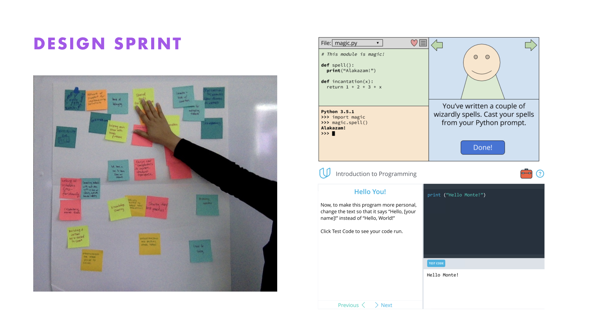
My goal was to reduce the high rate of students quitting the Udacity’s “Introduction to Programming” Nanodegree before submitting their first project. Our team participated in cross-team design sprint to evaluate how we create an empowering learning environment for beginner students. We decided to execute on the idea of designing an in-browser coding environment. We sketched, created a wireframe, and tested a low fidelity prototype with actual students.

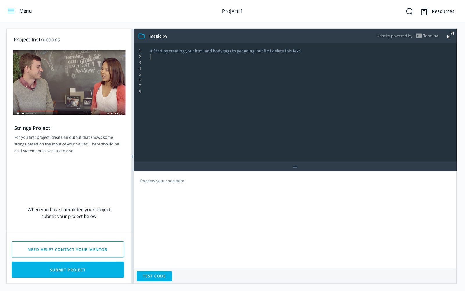
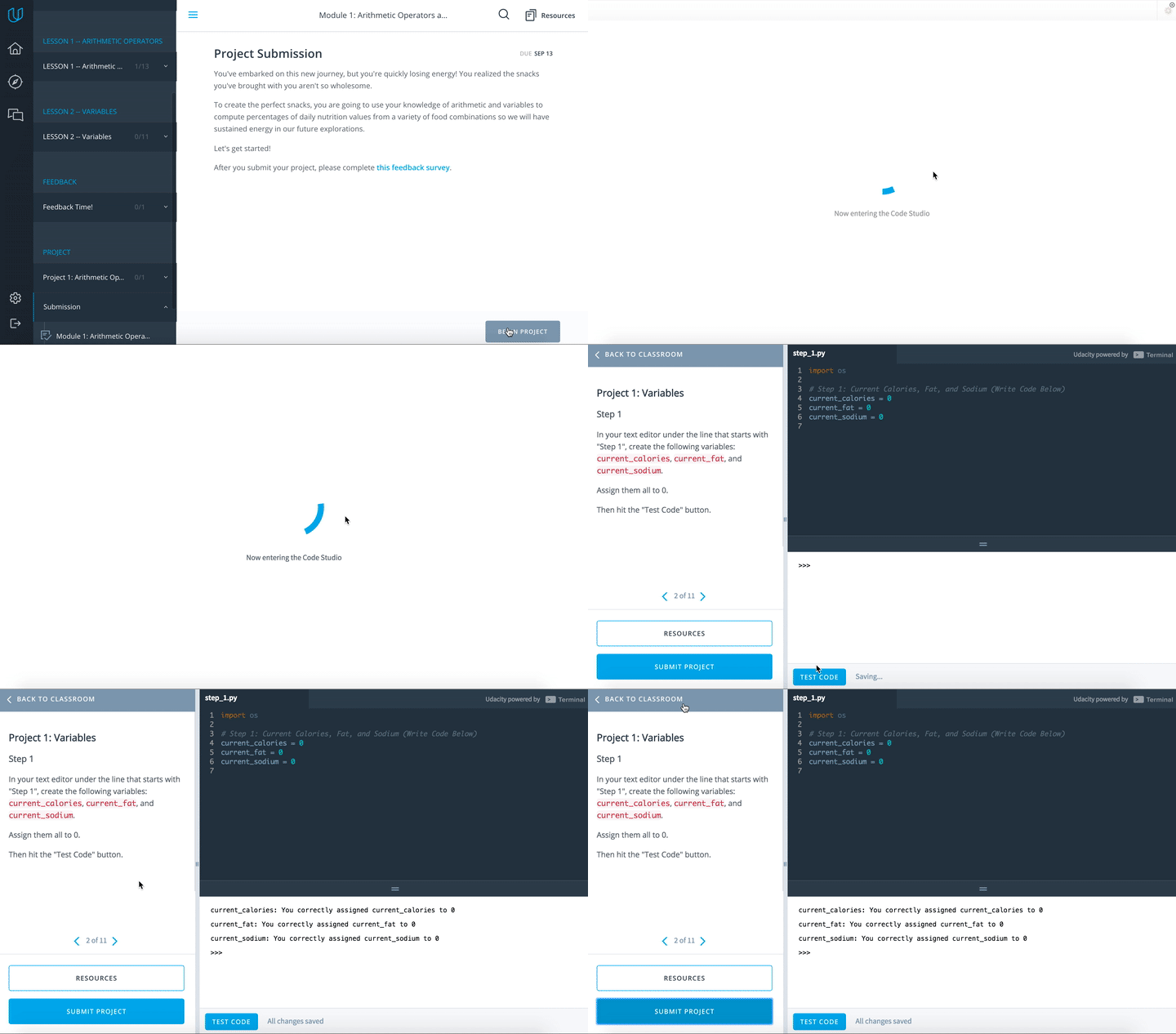
Based on user research, we identified our target students were beginners interested in learning how to code and have no no formal Computer Science education. Through our research we learned one of the major setbacks for beginner programmers is the need to set up their environment and download the proper tools. This experience is frustrating for beginners and has contributed to the regrettable churn at the outset of our program. To support beginners, we developed three main user journeys within the Code Studio. Students could write code in the browser, submit a project, or get help from a mentor all within a single view.

We gathered feedback from usability testing and found a two major pain points in the beta version. The “Submit Project” button was not intuitive. Many students completed their work without knowing they needed to submit their project. As a result, we made the “Submit Project” button more visible to students by relocating it to a more prominent location and by using a brighter color to draw more attention it.
Also we found students were not eager to use the “Get Help” button. We changed the “Get Help” button to “Resources” because many students were nervous about asking for help. The term “resources” was more neutral and encouraged more students to explore this feature.
There was enough evidence from our research to show that the Code Studio was a step in the right direction. As a result of this project, Udacity decided to acquire the Terminal.com engineering team to develop a future iteration of the Code Studio.
Read the full case study here.