Donation Checkout
GoFundMe is an online fundraising platform that enables people to receive donations in times of need. The donation checkout process enables donors from around the world to support the causes they believe in.
The goal for redesigning the donation checkout was to create a single experience that supported all payment processors. As the lead designer, I worked alongside the payments product manager and engineering team for six months.
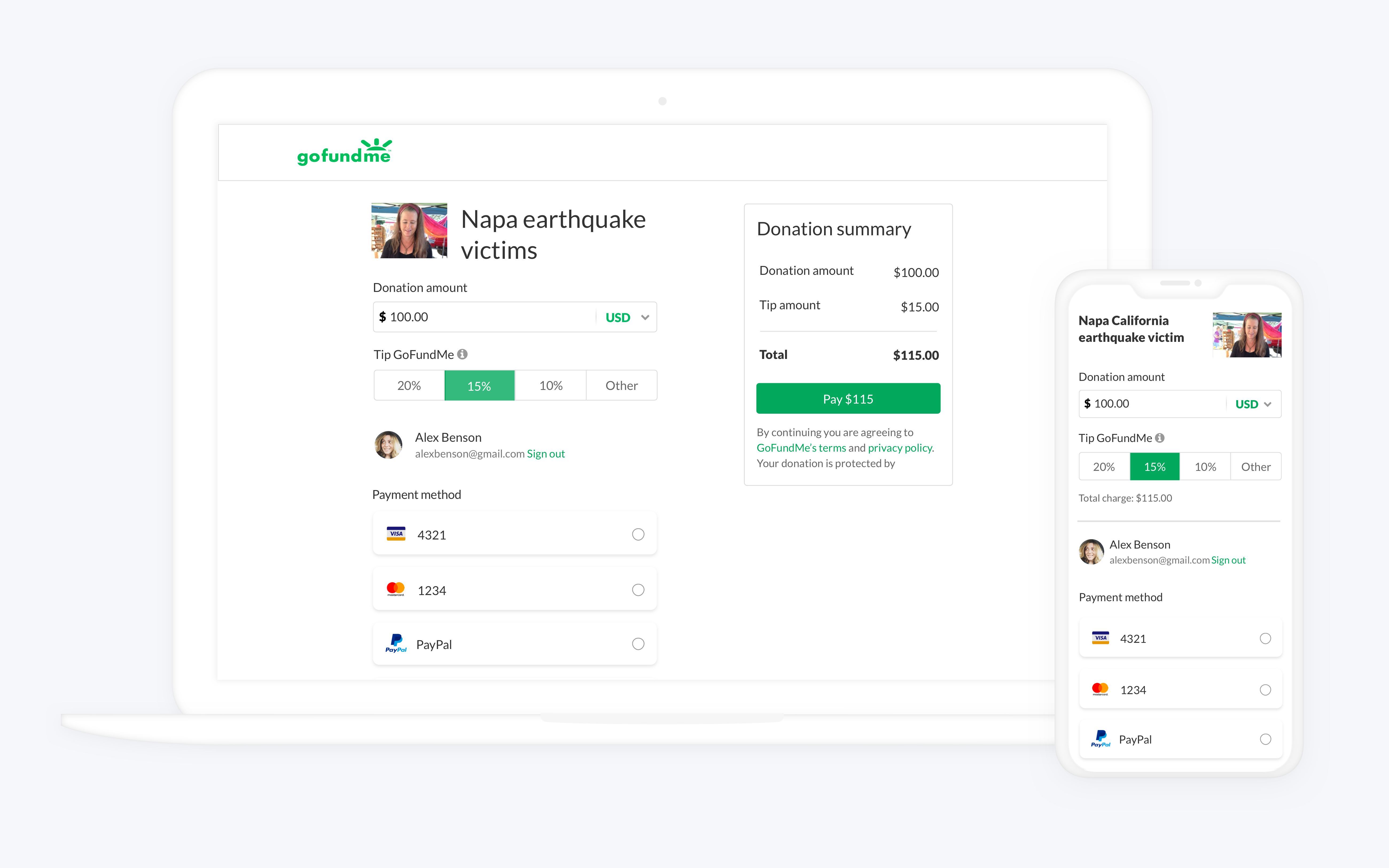
My role was to understand the main user journeys and design a solution that would optimize the checkout experience. During my explorations, I mapped out the two user journeys in the checkout experience: first time users and returning donors. Existing data showed that a large portion of our donor base were first time users. I decided to make the experience, by default, easiest for donors without an account.
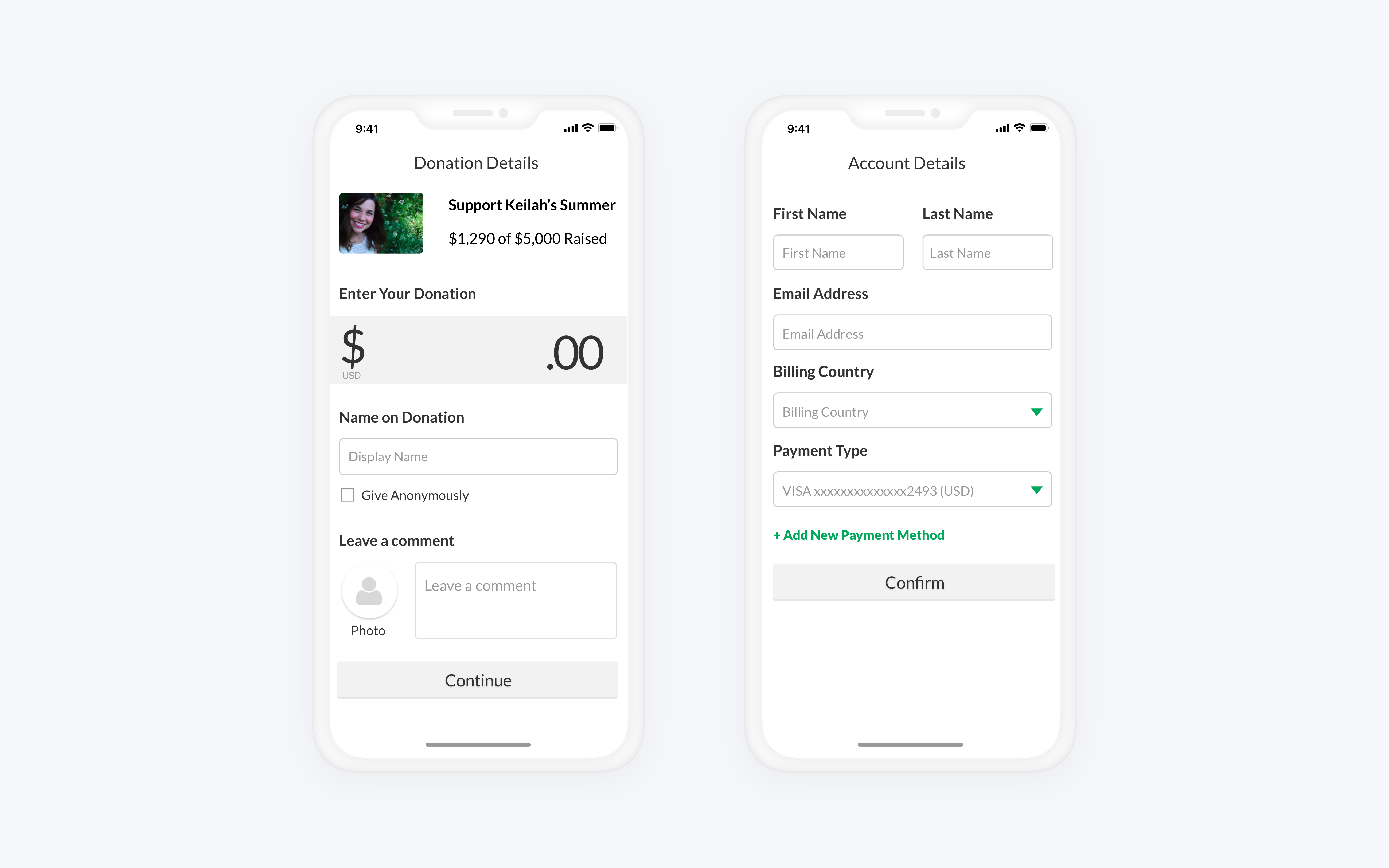
While creating the initial wireframes, I divided the checkout process into two steps. The first step included the donation details which would be public on the campaign page (donation amount, display name, and comment). The second step would include donor’s personal information (email address and payment information) which would be required to complete the transaction.
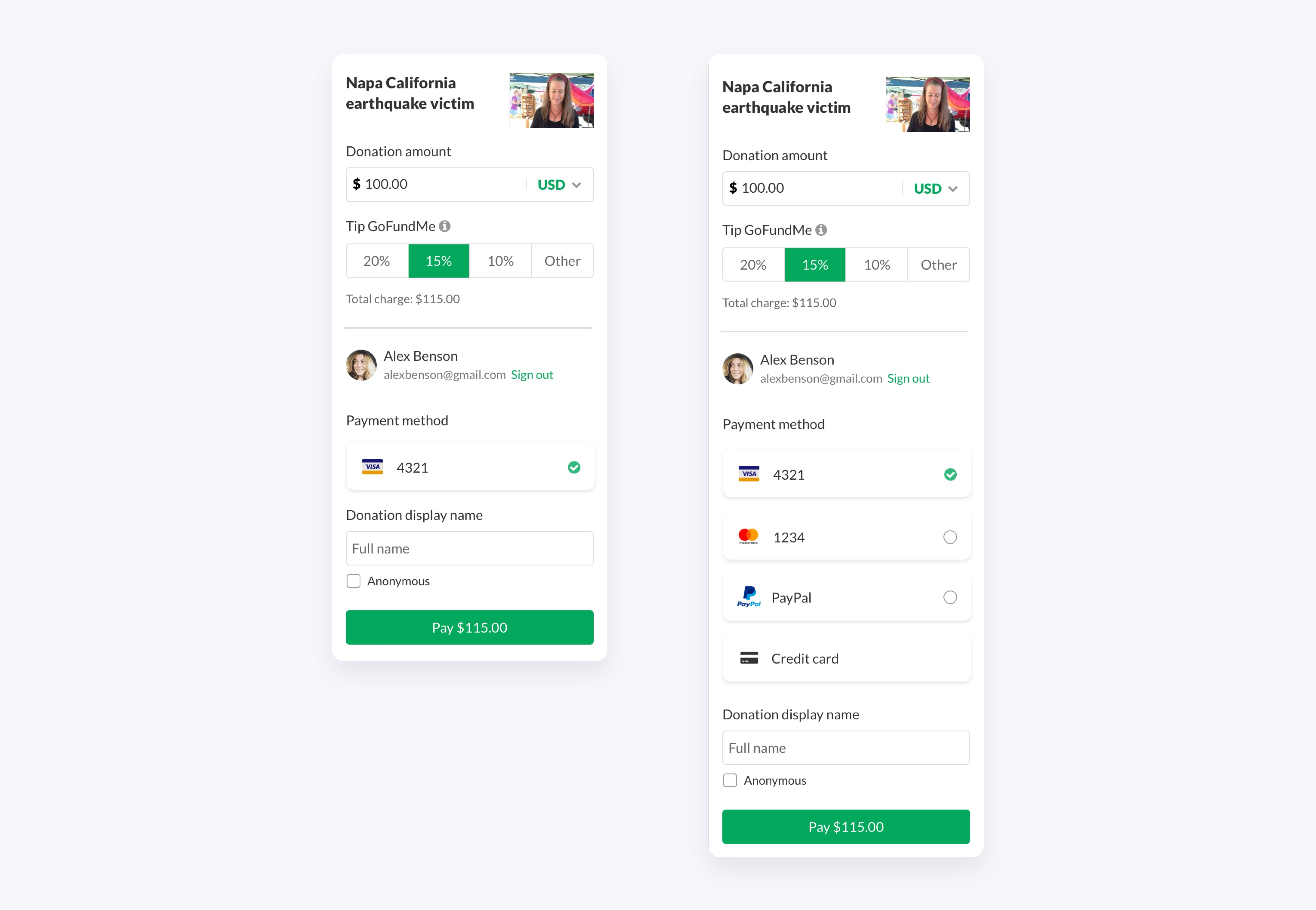
After conducting user testing on the initial wireframes, I received feedback that donors should be given the option to log-in before entering personal information. Returning donors with a saved credit card would have an optimized experience. Also, the two-step checkout process should be consolidated to one step to reduce the risk of conversion loss. I incorporated these pieces of feedback into the final designs.
Read the full case study published in UX Collective here .